Use the Design window to add new areas, lines and columns of stitching, as well as commands, to your character or SuperDesign, and to change the properties of stitching that you have already created.
Switch between windows by clicking the tabs at the top of the window.
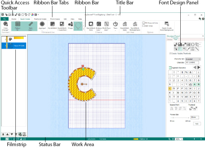
Font Tab
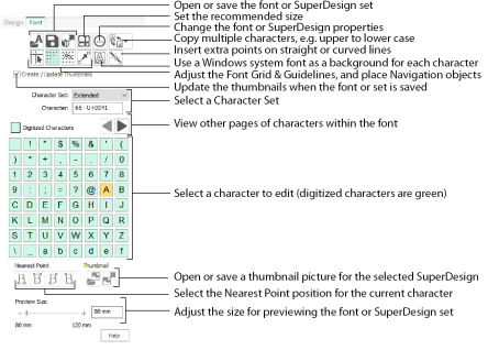
The Font Tab in the Design Panel contains functions for opening, saving, exporting, and editing the font or SuperDesign set, and for viewing and positioning the font grid, guidelines and background characters. Choose a background font and a character set, then select a character or SuperDesign for editing. Set the Nearest Point positions for fonts, and load and save thumbnail pictures for SuperDesigns. Preview the font or SuperDesign set at varying sizes.
The work area is the area with a grid where characters and SuperDesigns are digitized and edited. Stitch objects are drawn as outlines in the appropriate colors. Use mySewnet™ Configure to change the background grid color or the background color.
The background grid is shown as pale blue lines. Set the Grid Size in the View tab, and use the View Grid icon ![]() to turn the grid on or off.
to turn the grid on or off.
The Font Grid is shown as dots. It is used to align the points placed when designing characters. Use Show Font Grid ![]() to turn the font grid on or off.
to turn the font grid on or off.
When editing points for a character or SuperDesign, use Snap to Grid ![]() to force points to snap to positions at the font grid spacing.
to force points to snap to positions at the font grid spacing.
The blue lines at the top and to the left of the grid are guidelines. There are six horizontal and six vertical guidelines. They provide additional visual reference points.
To position the guidelines, select Move Guidelines ![]() and then click and drag the guideline to the desired position. The guidelines always snap to the dots of the font grid.
and then click and drag the guideline to the desired position. The guidelines always snap to the dots of the font grid.
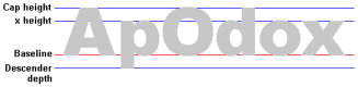
The guidelines are docked initially on the top and at the left of the grid. The suggested positions for the horizontal guidelines give the cap height, x height and descender depth. You may also wish to use a horizontal guideline to show the height of your start and end stitches, which is particularly useful for continuous fonts. Use the vertical guidelines to mark the right edge of characters that are the same width (for instance, 'b', 'd', 'p').
The same guideline positions are used for the whole font or SuperDesign set. The same height and width can therefore be used for each similar character. For instance, 'a' and 'u' would normally be the same height and width, while 'm' and 'w' would be wider.
The baseline is the line on which most characters will sit. It is a special red guideline which is placed at the base of the capital A when the font is created.
Use Move Guidelines  to change the position of the baseline.